Portrait of Matthew A. Davis

Matthew A. Davis

Operations · Corporate Development · Design & Communications · Independent R&D

matthewdavis-ops.github.io | matthewdavis.ops@gmail.com | Erwin, Tennessee | Resume (PDF)

Five Sites · 2010 — Present

Web Design

Five sites across fifteen years, ten screens. One is the day job. The other four were built off the clock — for a band, a novelist, a furniture business and nobody in particular, with no framework, no platform, no template and no stylesheet worth the name: HTML tables, images cut by hand in Photoshop, and a rollover state drawn for every single one of them.

Every screen below is a screenshot, not a mockup or a rebuild — the live site as it serves today, and the rest opened from their original files in a current browser.

The Day Job

The day job, and the only site on this page you can still open: sharedhealthservices.com. Everything after it was built off the clock.

Full-page capture of the Shared Health Services home page: a logo and illustrated staff ribbon reading Real People, Real Support, Real Results, a navigation bar and search field, a hero video still of two clinicians at a monitor captioned Pursue Excellence, No Exceptions, then sections on program design, compliance and reimbursement, four testimonial cards from wound care directors and managers, a place-of-service code matrix, a contact block, three clinical blog cards and a footer carrying three award seals.
sharedhealthservices.com · home · live today The corporate site for a wound care management company, built in-house end to end. Hero video, partner testimonials from four facilities, a place-of-service support matrix, a discovery-call funnel, and a clinical blog running under its own masthead. Three national awards sit in that footer; they’re listed with the rest on the profile page.

It is also the only one here not hand-cut — it runs on Wix, and that is the point rather than the caveat. A four-person corporate team has to be able to add a post, swap a photo and correct a phone number on a Tuesday, without opening a code editor. The 2011 pages below prove the craft was there. This one is what the craft is for.
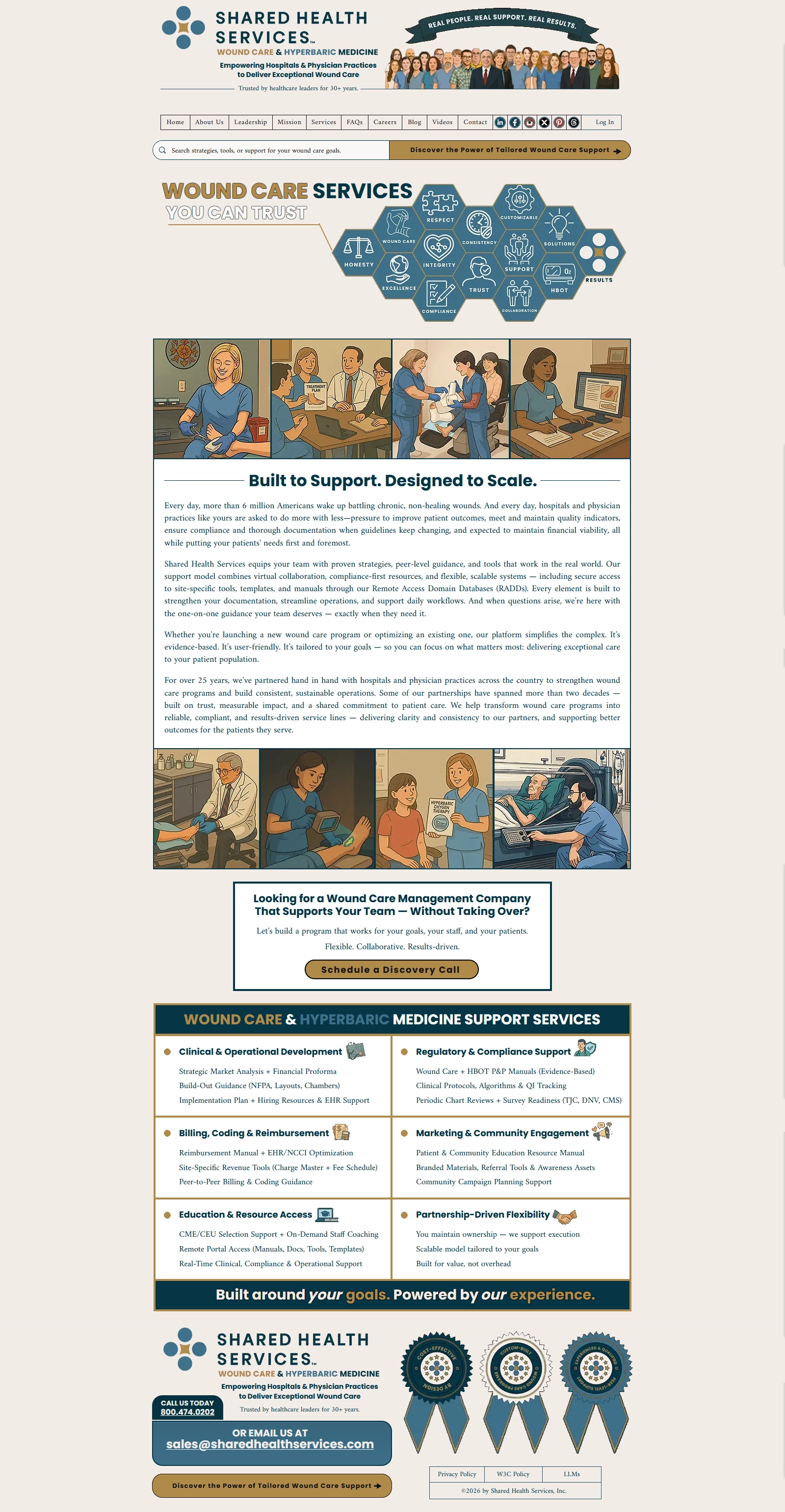
Full-page capture of the Shared Health Services services page: a logo and illustrated staff ribbon, a navigation bar and search field, a heading reading Wound Care Services You Can Trust beside a honeycomb of hexagonal icons for values including honesty, respect, integrity, compliance, support and results, two four-panel strips of illustrated clinical scenes, a body section headed Built to Support Designed to Scale, a discovery-call prompt, a six-category grid of support services, and a footer with contact details and three award seals.
sharedhealthservices.com · services · live today The home page proves a site got built. This one is the system underneath it. Eleven values on a honeycomb, each carrying its own drawn mark. Two four-panel strips of original illustration. A six-category service matrix that has to stay readable to a hospital executive and a clinic manager at the same time. That is an information architecture and a drawn language, not a page layout.

The illustration program running through it is the same one on the design page.

Before It Was Anyone’s Job

In order — and the first one is not shown. Attack Story’s original site, four rooms, each its own full-screen Photoshop comp sliced into a table, was live by December 2010 and survives only in the Internet Archive: the images are long gone, but the markup still names all four source files.
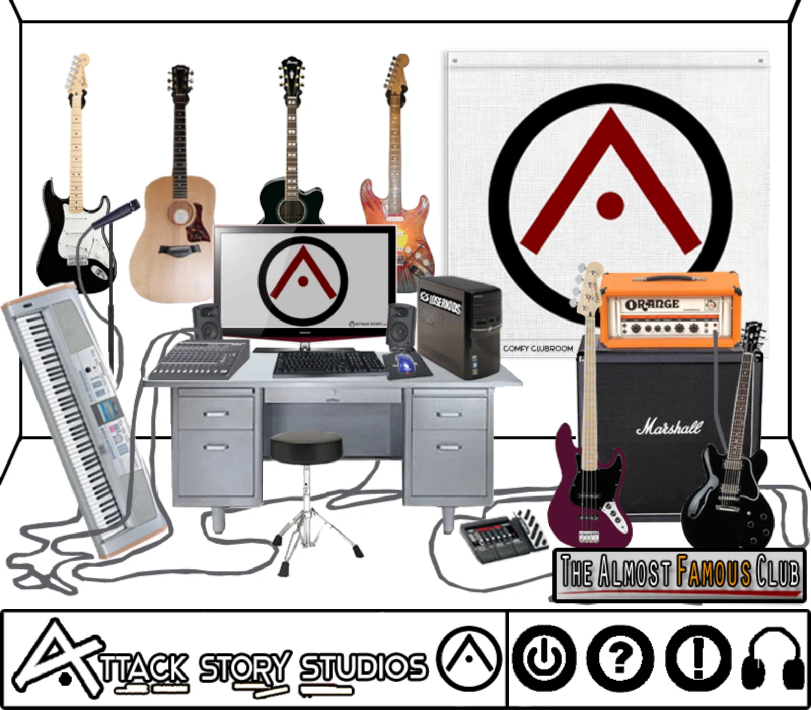
A recording studio drawn and collaged as a single flat room: four guitars and a keyboard along the left wall, a desk with a monitor, mixer and tower in the center, a drum throne, a bass, an Orange amp head on a Marshall cabinet and a hollowbody guitar on the right, with a banner reading The Almost Famous Club and a nav bar below reading Attack Story Studios.
Attack Story · The Studio · April — May 2011 A recording studio built as a room you click around in. Not a page with links on it — a place. The keyboard goes somewhere. So do each of the four guitars, the mixer, the pedal board, the drum throne, the tower and the screen. The architecture is one table, seven rows, forty-two cells, and twenty-one images holding it together.
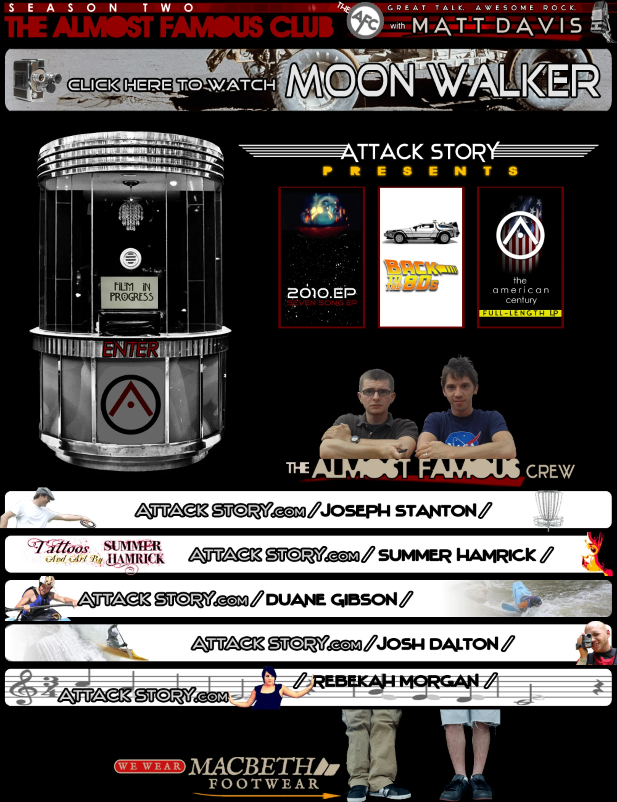
A dark web page headed Season Two, The Almost Famous Club, Great Talk Awesome Rock, with Matt Davis. Below, a photographed ticket booth marked ENTER, three album panels for 2010.EP, Back to the 80s and The American Century, a crew photograph, and five horizontal name bars each combining a person's name with imagery of what they do.
Attack Story · Splash · July 2011 Attack Story’s splash page, built to carry the podcast it hosted. The Almost Famous Club had a site of its own; this is the band’s front door making room for it — season two by July 2011, a new co-host every week, someone local doing something worth hearing about. The ticket booth is the way in, three Attack Story releases sit on the shelf beside it, but the five horizontal lanes below are the actual architecture — disc golf, tattoo art, a play boat, a creek boat and a camcorder, a bar of sheet music — each one built from that guest’s own work, and each one that person’s own address on the domain. Five of many.

Both lifting each other, and both lifting everyone they put on. That was the model, and the site is built to run it: a shared front door, with rooms behind it that belong to somebody else.
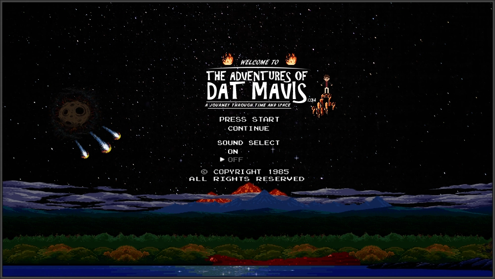
A pixel-art title screen on a starfield: a volcanic mountain range, forest and shoreline across the lower third, comets and a cratered moon at left, a small figure riding a rocket at right, and centered text reading Welcome to The Adventures of Dat Mavis dot com, A Journey Through Time and Space, above menu lines reading Press Start, Continue, Sound Select On, Off, and a line reading copyright 1985 all rights reserved.
DatMavis.com · Title Screen · 2010 — 2015 It does not open like a website. It boots. Press Start. Continue — on a static HTML site with no saved state to continue from, which is a joke rather than a feature. Sound Select, cursor parked on OFF. A copyright line reading 1985.

Which means the screen after this one is not a front door. It is level one.
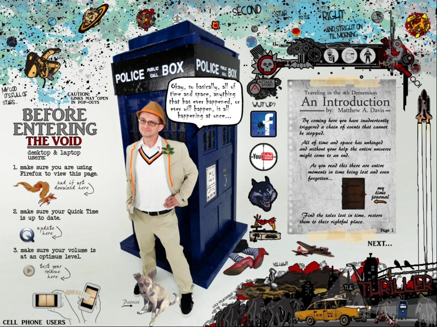
Collage web page: a police-box prop with a figure standing beside it and a small dog, surrounded by hand-lettered instructions, planets, a typeset introduction on a taped journal page, and a cityscape.
DatMavis.com · Home · 2010 — 2015 Past the title screen, the world itself — a journal you walk around in rather than scroll through. This screen is one table, twenty-four rows, eighty-eight cells, and about a hundred hand-cut GIFs, every rollover state drawn by hand in Photoshop and wired in Dreamweaver. The planets across the top are real destinations. So is the police box, which is a prop built for Halloween in 2011 and photographed for the page.

The navigation is written in the world’s own language: the link to Neverland isn’t labeled Neverland — it’s the words second star to the right, and straight on till morning, lettered across the sky. And in the lower left, a separate set of instructions for cell phone users, in 2015.
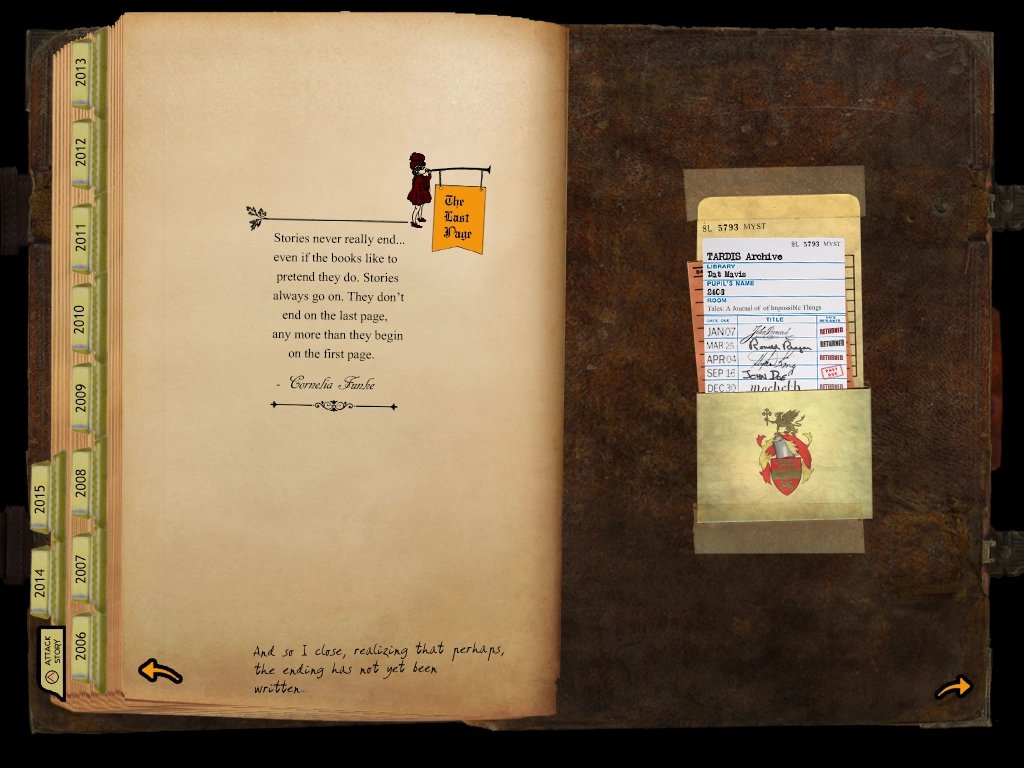
An open leather journal photographed on black. The left page carries a small illustration of a figure holding a banner reading The Last Page, a centered quotation set in serif type, and a handwritten closing line at the foot. Year tabs run down the left edge from 2006 to 2013, with 2014 and 2015 projecting further out, and a tab at the bottom reading Attack Story. The right page holds a taped library card pocket headed TARDIS Archive, with a date-due card listing borrowers and a small heraldic crest.
DatMavis.com · The Last Page · 2010 — 2015 And the way back out. Down the edge of the journal is the index: a tab for every year from 2006 to 2013 — and then 2014 and 2015, added later and sitting proud of the stack. That offset is the tell. The site was kept, not built. The band gets a tab of its own.

On the facing page, a library pocket for a book nobody could borrow: A Journal of Impossible Things, shelved at BL 5793 MYST, signed out by John Smith, Ronald Reagan, James Dean and Macbeth. The quotation on the left is Cornelia Funke’s, on stories not ending where the book does. The line beneath it is handwritten, and it is the last thing on the site.
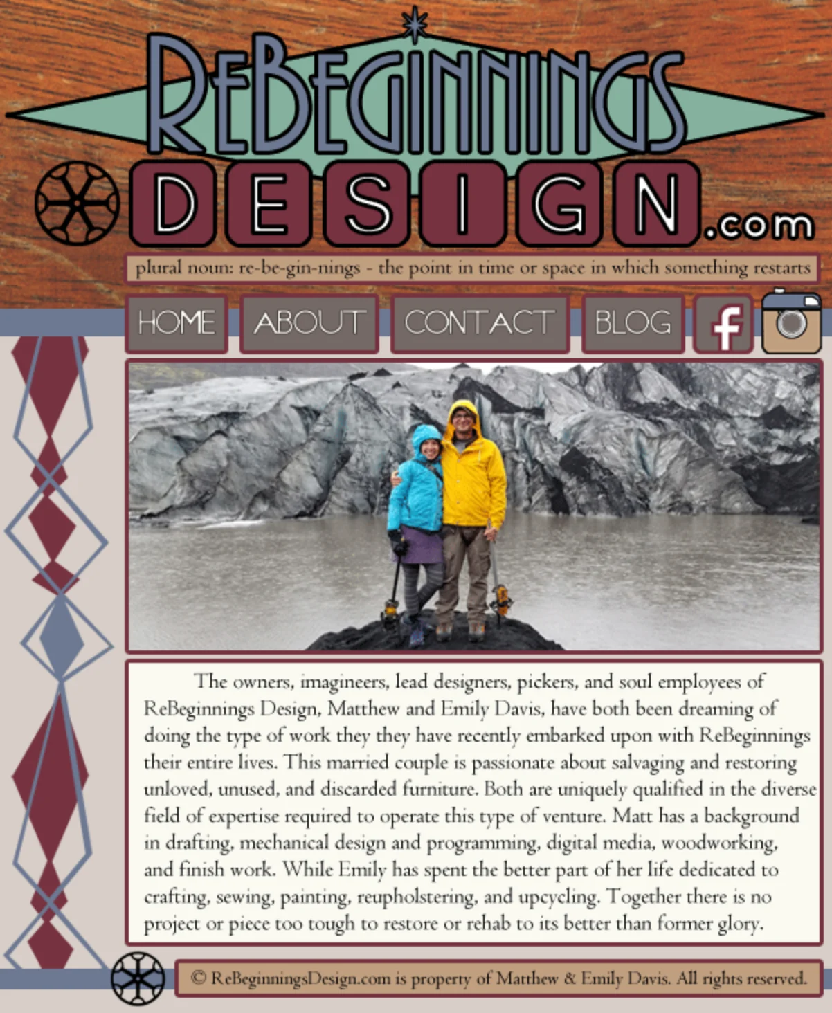
Website header on a wood-grain background reading ReBeginnings Design dot com in a custom hand-drawn wordmark, with a dictionary definition beneath it, a nav row, a photograph of a couple standing on rock in front of a glacier, and a paragraph of serif body text in a bordered panel.
ReBeginningsDesign.com · About · 2018 — 2019 The furniture-restoration business my wife, Emily, and I ran. Pieces headed for the dump, intercepted, restored, and sold. Everything on this screen is original: the wordmark, the compass mark, the hand-drawn diamond rail down the left side, the palette taken off the wood.

The detail worth stopping on is directly under the logo, where a site that sells restored furniture quietly defines its own name — plural noun: re·be·gin·nings — the point in time or space in which something restarts. That is the whole business model, set in 11px type, above the fold.

Note also the canvas: 601 pixels wide, fixed. That is what a small site looked like before responsive layout was the default — built to one width and no other, on the assumption that everyone arrived at a desk.
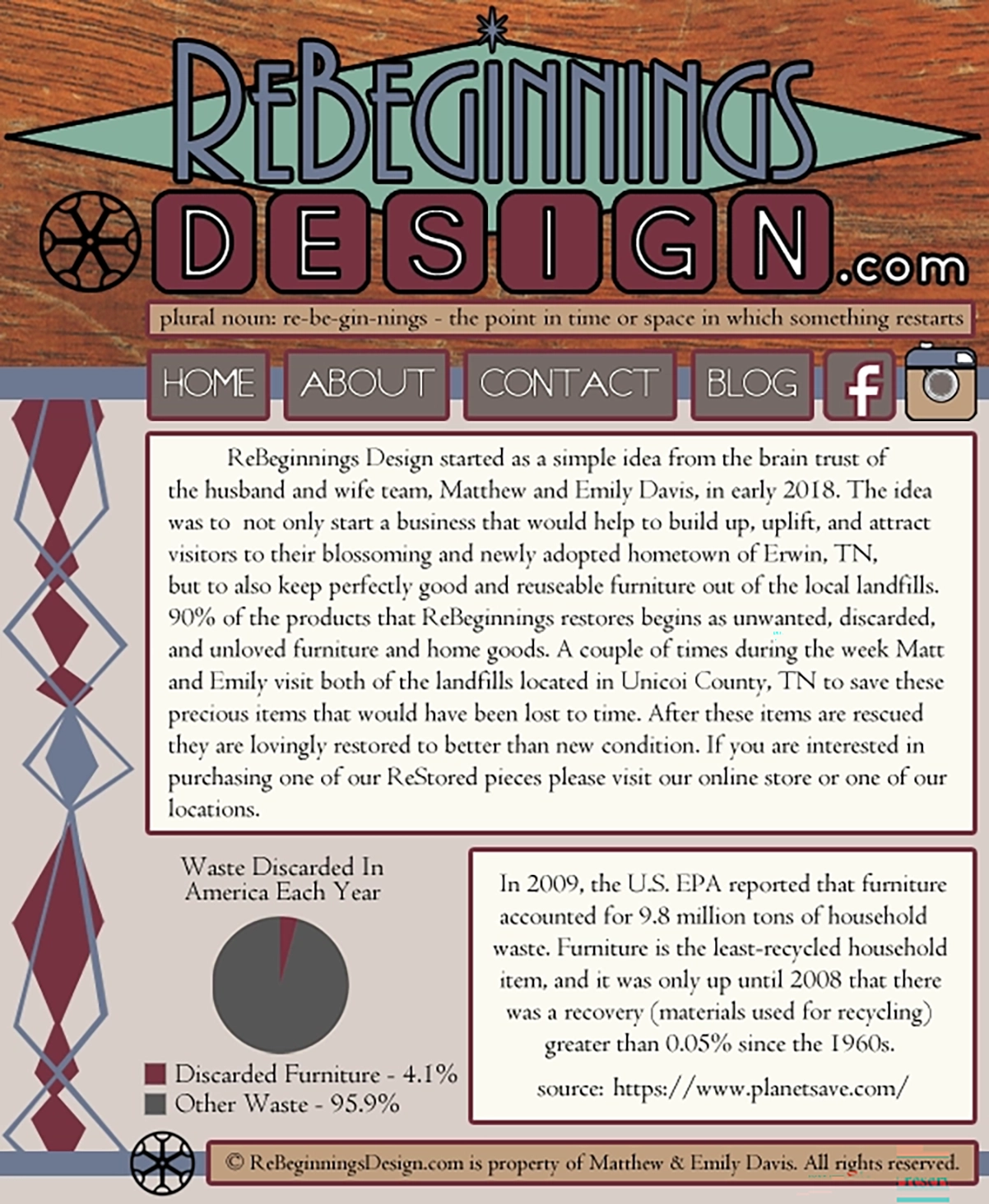
A fixed-width website home page on a wood-grain background: a hand-lettered ReBeginnings Design wordmark with a compass mark and a star, a dictionary definition of the word set beneath it, a navigation row, a bordered paragraph describing the husband-and-wife furniture restoration business, a pie chart titled Waste Discarded In America Each Year, and a bordered panel carrying a cited EPA statistic.
ReBeginningsDesign.com · home · 2018 — 2019 The front page of that same 601-pixel site — wordmark, compass mark and the hand-drawn diamond rail, all of it original.

The part worth stopping on is the bottom half. A furniture restoration business arguing its own case with data: a pie chart of American household waste, and an EPA figure on furniture being the least-recycled household item — cited, on the page, below the fold. Nobody asked for that. It is there because somebody wanted the claim to hold up.
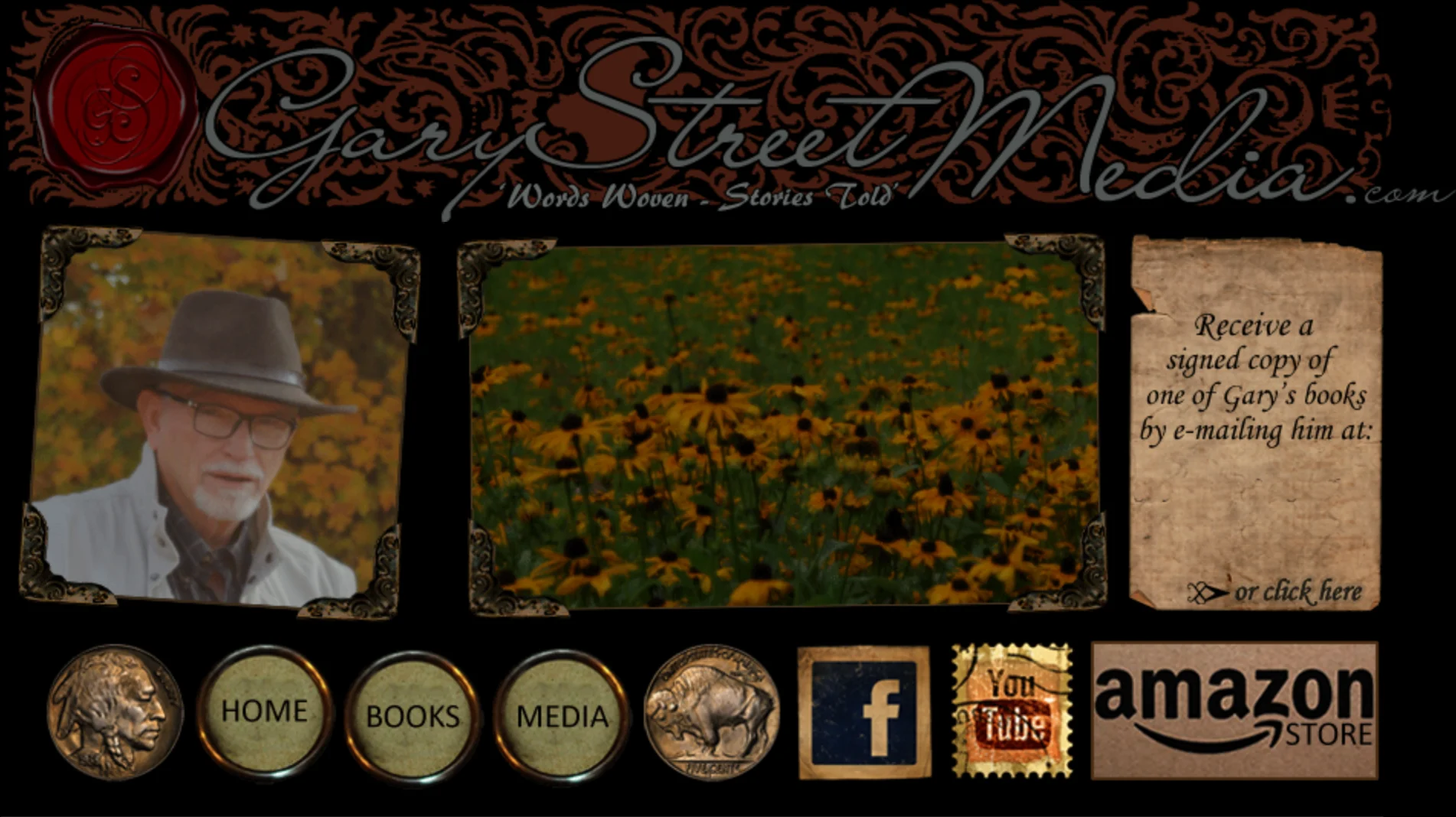
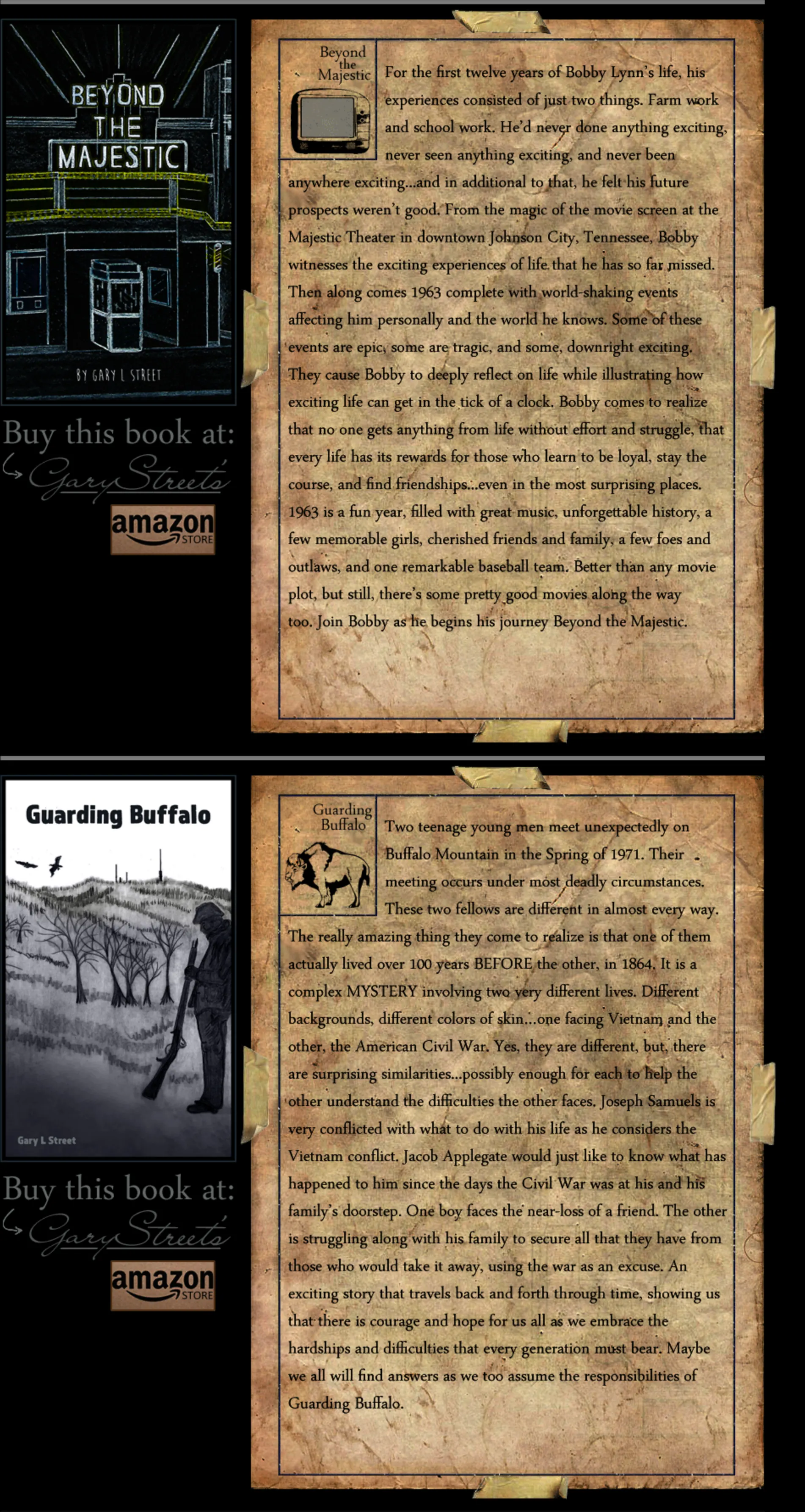
Website masthead on black: an ornate filigree banner with a red wax seal reading Gary Street Media dot com, Words Woven - Stories Told, beneath it a photograph of an older man in a fedora, a photograph of a field of black-eyed susans, and a torn kraft-paper panel; below, a nav row whose buttons are buffalo nickels alongside postage-stamp social icons and an Amazon Store button.Two book entries from the same page, each pairing a cover illustration on the left with a long synopsis set on an aged, torn parchment panel on the right: Beyond the Majestic, and below it Guarding Buffalo.
GaryStreetMedia.com · Books · June 2018 — March 2020 Built for a novelist — and then run for two years. Gary Street spent seven years teaching the same group of boys at a Johnson City church, sixth grade through twelfth. He retired out of a career in sales, started writing, and set all of it in Appalachia — Jonesborough, Roan Mountain, downtown Johnson City. He was a mentor. He died in August 2021.

The design is themed to the work rather than decorated: a wax seal, filigree, aged paper torn at the edges, social links as postage stamps, and a navigation bar whose buttons are buffalo nickels — flanked, if you look, by the actual obverse and reverse of the coin.

But the part a screenshot can’t show is the dates on the files. Books one through four are June 2018. Book five is October 2018. Book six is May 2019. Book seven is March 21, 2020. Each one meant a new cover cut, a new parchment panel set, a new nickel drawn and the page rebuilt around it. This is not a site that was built. It’s a site that was kept.

Two of the seven are shown. The real page runs 6,832 pixels — the same module, seven times. He finished ten novels and a book of poetry in all; the site carries the seven that existed when it was last updated.

One element has been removed from this screenshot: a panel inviting readers to email Gary directly. The address is a private one belonging to a man who has died, and it is not reproduced here. Nothing else on this screen has been altered.

Every image on this screen has a second state — a hover variant, drawn separately and preloaded in JavaScript before the page finishes opening. The drawn artwork is therefore roughly double what any screenshot of it can show.